


Financial Analytics & Automation / Power BI Dashboard Creation Series
Before Starting This Series
In the Financial Insights category, we focus on a simple but important question:
Which metrics should management pay attention to?
The KPIs that support business decisions vary by industry. In manufacturing, management may focus on equipment utilization and inventory turnover. In retail, inventory turnover and average transaction value are often critical. In construction, project profit margins and order backlog play a key role.
However, understanding KPIs is only the first step. To make those metrics useful in practice, organizations need a way to collect, visualize, and analyze them consistently.
That’s where Power BI comes in.
In this Power BI Dashboard Creation series, we will build a Financial KPI Dashboard using Power Query, Power BI, and DAX, step by step.
By the end of this series, you will be able to create an interactive dashboard from raw CSV files and transform financial data into actionable business insights.
In this first article, we will look at the completed dashboard and discuss why Power BI is such a valuable tool for finance and management professionals.
How Much Time Do You Spend Preparing Monthly Reports?
For finance and management teams, reporting is a recurring monthly task.
Data is exported from multiple systems, consolidated in Excel, transformed into charts and tables, and finally incorporated into management reports.
Then someone asks for additional analysis or clarification, and the process begins again.
| Work | Estimated Time / Month |
|---|---|
| Data Collection and Export | 1 to 2 hours |
| Data Aggregation and Processing in Excel | 2 to 3 hours |
| Updating Charts and Tables | 1 to 2 hours |
| Review and Revisions | 2 to 3 hours |
| Total | 6 to 10 hours |
That amounts to roughly 72–120 hours per year spent on reporting activities alone.
The exact numbers vary by organization, but many finance teams spend a significant amount of time producing reports instead of analyzing the business behind them.
The Dashboard We Will Build
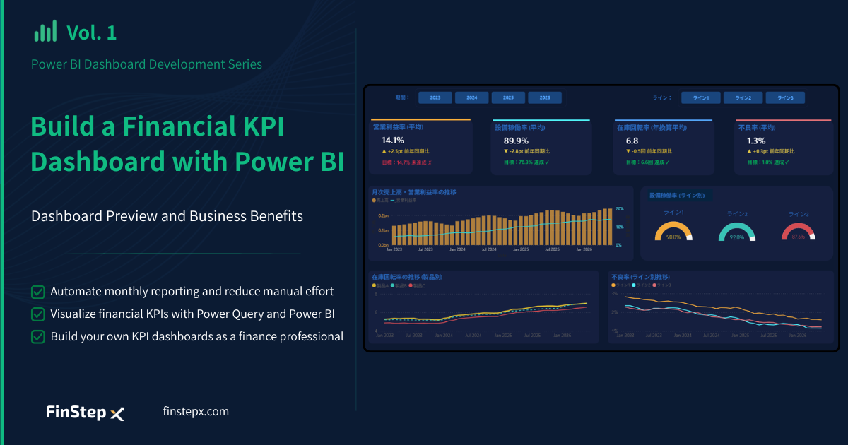
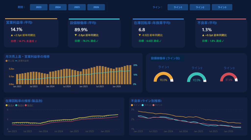
The dashboard featured in this series is designed for a manufacturing company and focuses on several key financial and operational KPIs.
The top section displays metrics that management should monitor continuously:
- Operating Profit Margin
- Equipment Utilization Rate
- Inventory Turnover Rate
- Defect Rate
For each KPI, the dashboard shows:
- Current performance
- Year-over-year comparison
- Progress against target
This allows management to understand performance at a glance.
For example, the dashboard may show that equipment utilization and inventory turnover have achieved their targets while operating profit margin remains below expectations.
This immediately raises an important business question:
Why is profitability lagging even though operational efficiency is improving?
A dashboard should do more than display numbers. It should help decision-makers identify trends, detect issues, and determine where to investigate next.
The lower section of the dashboard includes:
- Sales and Operating Profit Margin Trends
- Equipment Utilization by Production Line
- Inventory Turnover by Product
- Defect Rate Trends by Production Line
The dashboard also includes slicers that allow users to filter data by period or production line.
If management asks, “Show me only Line 2” or “Let’s review 2025 performance,” the dashboard can be updated instantly without rebuilding reports or charts.
This is the power of Power Query and Power BI.
The Roles of Power Query and Power BI
Power Query: Preparing the Data
Power Query is a data preparation and transformation tool.
It allows you to import data from CSV files, Excel workbooks, databases, and many other sources. You can remove unnecessary columns, merge tables, clean data, and automate repetitive preparation tasks.
One of its biggest advantages is that every transformation step is recorded. When new data arrives next month, you simply refresh the query instead of repeating the entire process manually.
In many organizations, Power Query serves as a lightweight ETL (Extract, Transform, Load) tool.
Power BI: Visualizing and Analyzing Data
Power BI is used to transform prepared data into meaningful insights.
Charts, tables, KPI cards, and interactive filters help management and operational teams make better decisions based on current information.
Using DAX (Data Analysis Expressions), you can also calculate advanced metrics such as:
- Year-over-Year Growth
- Target Achievement Rate
- Rolling Averages
- Cumulative Totals
| Component | Role |
| Power Query | Data Import and Transformation |
| Power BI | Visualization and Analysis |
| DAX | KPI Calculations |
What Changes After Implementing Power BI?
Implementing Power BI changes the reporting process itself.
Traditionally, the workflow looks something like this:
Data Collection → Data Aggregation → Chart Creation → Report Preparation
After implementing Power BI, the workflow becomes:
Data Refresh → Dashboard Review → Analysis and Decision Support
The real benefit is not simply saving time. The role of finance professionals is not to produce reports. It is to interpret data and support better business decisions.
With less time spent on manual reporting, finance teams can focus on higher-value activities such as:
- Analyzing the causes of declining profit margins
- Assessing the impact of rising costs
- Identifying opportunities to reduce inventory levels
- Performing scenario analysis for future business planning
This is where finance creates value for the organization.
What You’ll Learn in This Series
Rather than building the dashboard all at once, we will develop it step by step from the ground up.
| Episode | Contents |
| Vol. 2 | Power BI Desktop basics and setup |
| Vol. 3 | Cleaning and shaping data with Power Query |
| Vol. 4 | Building a calendar table and setting relationships |
| Vol. 5 | DAX fundamentals |
| Vol. 6 | Building charts and tables |
| Vol. 7 | Slicer and Filter |
| Vol. 8 | Dashboard Design |
| Vol. 9 | Sharing and maintenance |
By combining the knowledge from the Financial Insights series—what to measure—with the skills from this series—how to visualize it—you will be able to build your own KPI dashboards and deliver more effective business insights.
Frequently Asked Questions (FAQ)
1. Is Power BI free to use?
Yes. Power BI Desktop is available free of charge. If you are learning Power BI or creating dashboards for personal use, the free version is usually sufficient. Sharing dashboards with others typically requires a Power BI Pro or similar license.
2. If I know Excel, can I learn Power BI?
Absolutely. Power BI is generally considered easy to learn for Excel users. Power Query is available in both Excel and Power BI, so users with experience in data preparation often adapt quickly.
3. What is the difference between Power BI and Excel?
Excel is excellent for data entry, ad hoc analysis, and spreadsheet-based reporting. Power BI is designed for large-scale data modeling, visualization, automation, and sharing. In most organizations, Power BI complements Excel rather than replacing it.
4. Why should finance professionals learn Power BI?
Power BI reduces the time spent on manual reporting and data aggregation. This allows finance professionals to focus more on value-added activities such as variance analysis, profitability analysis, forecasting, and business decision support.
5. What financial KPIs can be visualized in Power BI?
Power BI can visualize a wide range of financial and operational KPIs, including revenue, operating profit margin, budget versus actual variance, inventory turnover, equipment utilization, cash flow, and industry-specific performance indicators.
Summary
Power Query and Power BI can dramatically improve the efficiency of monthly reporting processes.
However, the real value goes beyond saving time.
Finance professionals are not responsible for creating reports—they are responsible for interpreting data and helping management make better decisions.
Power BI helps finance teams spend less time producing reports and more time generating insights.
Coming Up Next
In Vol.2, we’ll prepare to build the Dashboard by installing Power BI Desktop and reviewing its basic interface. We’ll get familiar with core areas you’ll use throughout the series, such as the Ribbon and the Report Canvas. Let’s start by setting up the environment—the first step in this series.