


Financial Analytics & Automation / Power BI KPI Dashboard Creation Series
Introduction
In Vol. 3, we imported five CSV files using Power Query and prepared the column names and data types.
In this article, we will build the foundation of the data model needed to combine and analyze multiple tables in Power BI.
Specifically, we will:
- Create a Calendar table
- Set up relationships between the tables
Once these two steps are complete, we will be able to analyze all data using two common dimensions: date and production line.
What Is a Calendar Table?
In real-world business analysis, time-based analysis is often required for tasks such as:
- Calculating year-over-year changes
- Aggregating data by year or quarter
- Analyzing multiple fact tables over the same time period
To perform these types of analysis consistently, it is important to manage the dates in each fact table using a common reference. This is where a Calendar table comes in.
By creating a Calendar table and establishing relationships with the fact tables, we can analyze different types of data using the same time dimension.
In Vol. 3, we set the Year/Month column in each fact table to the Date data type. This was preparation for connecting those tables to the Calendar table.
Step 1: Create a Calendar Table Using DAX
In this article, we will use DAX to create a Calendar table in Power BI Desktop.
1. Create the Calendar Table
Go to Modeling → New table.
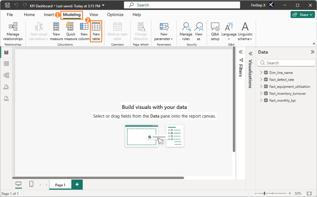
Copy and paste the following DAX expression in the formula bar and press Enter.
Calendar =
VAR MinDate = MIN(Fact_monthly_kpi[Year/Month])
VAR MaxDate = MAX(Fact_monthly_kpi[Year/Month])
RETURN
    CALENDAR(
        DATE(YEAR(MinDate), 1, 1),
        EOMONTH(MaxDate, 0)
    )
In the Data pane on the right, confirm that a new Calendar table with a calculator icon has been created.
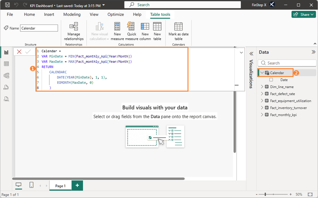
2. Check the Dates and Data Type
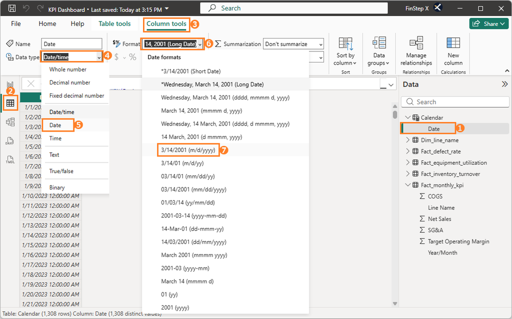
Once the Calendar table has been created, check that the Date column covers the period from January 1, 2023 to July 31, 2026.
If the Data type is set to Date/Time, select the Column tools tab and change Data type to “Date” and Format to “Short date”.
Step 2: Mark the Calendar Table as a Date Table
Simply creating a Calendar table does not automatically tell Power BI that the table is intended to serve as a dedicated date table.
To use date intelligence functions correctly for time-based calculations such as year-over-year comparisons, we need to mark the Calendar table as a date table.
With the Calendar table selected, go to Table tools → Mark as date table.
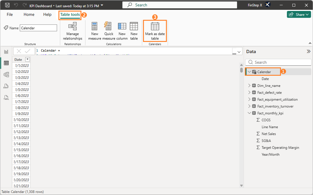
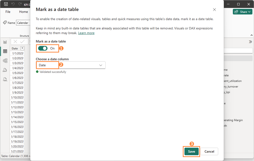
In the dialog box that appears, set “Mark as a date table” to “On”, and select the “Date” column on the “Choose a date column” field, then click Save.
The Calendar table can now be used as the basis for time-based analysis.
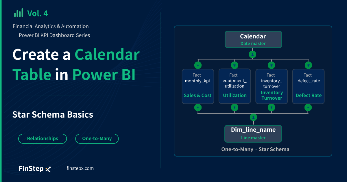
Step 3: Understand the Role of Each Table — Star Schema
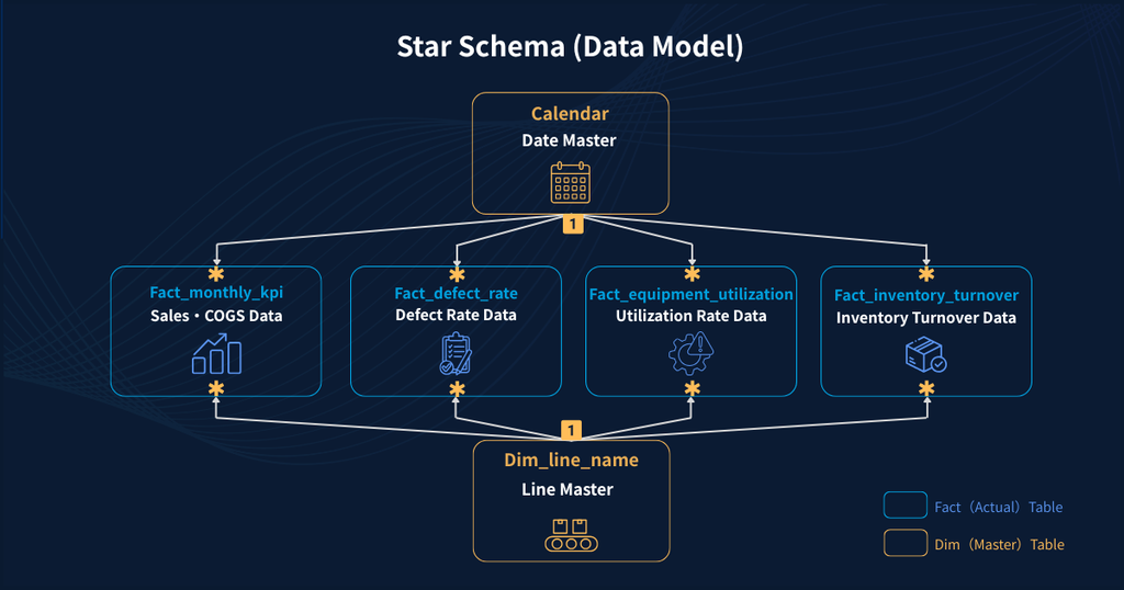
Before creating the relationships, let’s clarify the role of each of the six tables in our data model.
| Table | Role |
|---|---|
Calendar | Date master |
Dim_line_name | Production line master |
Fact_monthly_kpi | Revenue and cost data |
Fact_equipment_utilization | Equipment utilization data |
Fact_inventory_turnover | Inventory turnover data |
Fact_defect_rate | Defect rate data |
In Power BI, we build a data model by connecting fact tables to master or dimension tables that provide the axes used for analysis.
This structure is called a Star Schema.
A star schema keeps the data model simple, helps maintain consistent aggregations, and can also improve model performance.
Step 4: Create Relationships in Model View
We will now create relationships between the tables using the star schema in Model view. On the left side of Power BI Desktop, select the Model view icon.
1. Check the Automatically Created Relationships Between the Line Master and Fact Tables
Power BI can automatically detect relationships based on column names and data types. In this sample, Power BI should have automatically created relationships between Dim_line_name master table and each of the fact tables.
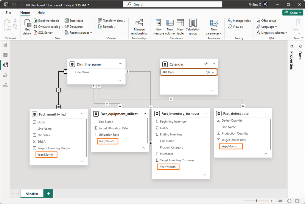
In Model view, confirm that the Dim_line_name master table is connected to each fact table by solid relationship lines, as shown below.
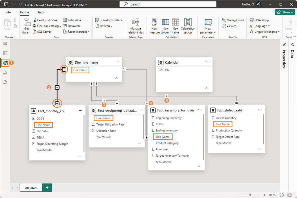
If a relationship has not been created, manually create it using the same process described below for the Calendar table. If an incorrect relationship has been created, right-click the relationship line, select Delete, and then create the correct relationship using the appropriate columns.
2. Manually Connect the Calendar Table to the Fact Tables
Because the Calendar table was newly created, Power BI will not automatically create relationships between it and the fact tables. We will create these relationships manually.
Drag the Date column from the Calendar master table and drop it onto the Year/Month column in the Fact_monthly_kpi table.
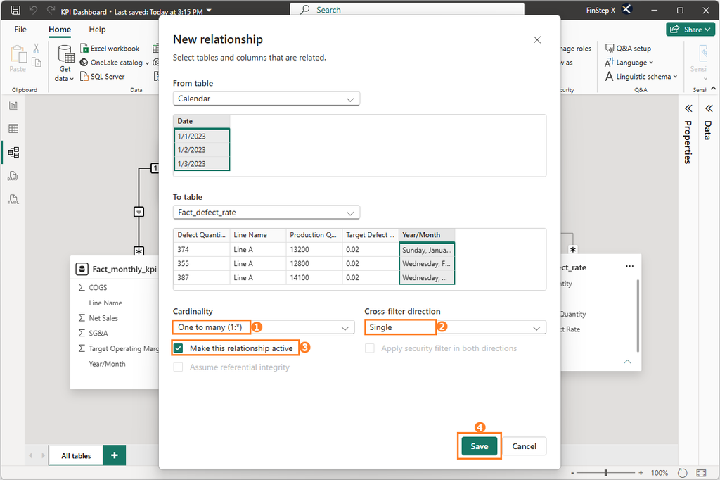
The New relationship dialog box will appear. Confirm that the following settings are selected, then click OK.
| Setting | Value |
|---|---|
| Cardinality | One to many |
| Cross-filter direction | Single |
| Make this relationship active | On |
Repeat the same process for the remaining three fact tables:
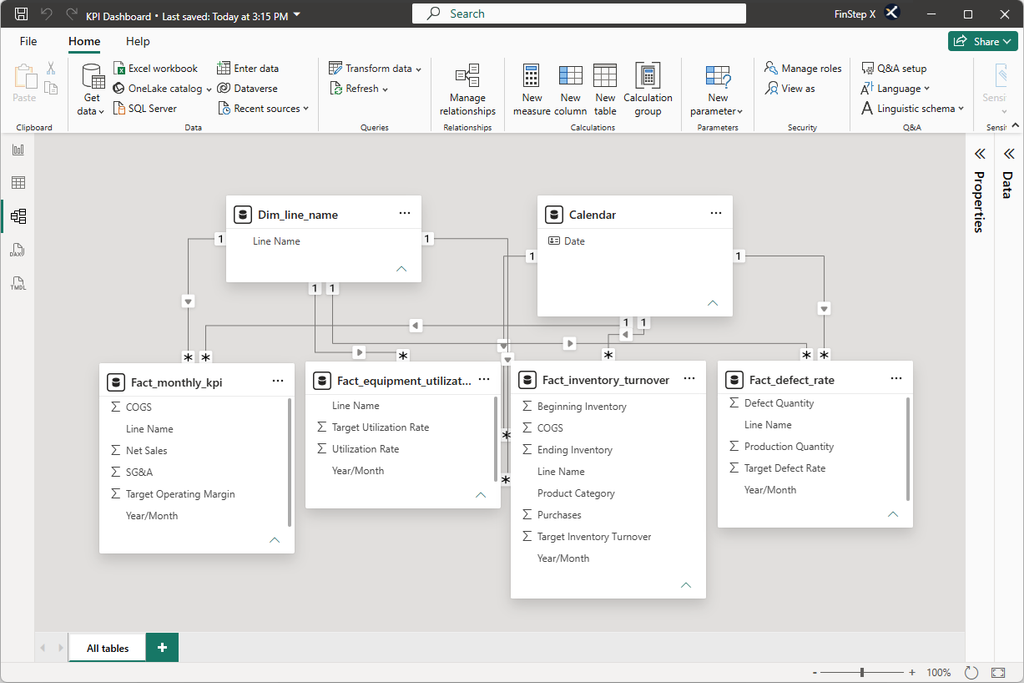
Calendar[Date]→Fact_equipment_utilization[Year/Month]Calendar[Date]→Fact_inventory_turnover[Year/Month]Calendar[Date]→Fact_defect_rate[Year/Month]
Once all relationships have been created, the star schema should look like the following.
Step 5: Save the File
Once you have finished configuring the data model, press Ctrl + S to save the file.
Vol. 3 created the initial KPI Dashboard.pbix file. The file now includes the Calendar table and the relationships we created in this article.
Summary
In this article, we completed two key tasks:
- Created a Calendar table using DAX
- Established relationships between the Calendar table and the fact tables
As a result, the six tables are now connected in a star schema, providing the data model needed for analysis in Power BI.
A well-designed data model makes it possible to analyze multiple fact tables using the same time and production-line dimensions. It also provides the foundation for the KPI calculations and dashboard we will build in the following articles.
Frequently Asked Questions (FAQ)
1. What is DAX?
DAX (Data Analysis Expressions) is a formula language used in Power BI to create calculated columns, measures, and more.
It is similar to Excel functions, but it can perform more advanced calculations, such as aggregations across multiple tables and year-over-year comparisons.
2. What is Cardinality?
Cardinality defines how tables are related to each other.
・One to One (1:1)
・One to Many (1: N) — the most common
・Many to One (N:1)
・Many to Many (N:N) — used in more complex models
In our model, the Calendar master table and Dim_line_name master table each have a one-to-many relationship with the fact tables.
3. What is Cross-filter direction?
It determines the direction in which data filters propagate between tables.
In this series, we use Single direction. Single direction is recommended for a simple star schema.
4. What is the difference between an Active and an Inactive relationship?
An active relationship is the one used in normal calculations.
An inactive relationship exists in the model but can not be used automatically. All relationships in our simple sample data model are active.
5. Why do I need a Calendar table?
The dates in the fact tables alone are not enough to calculate time-based measures such as year-over-year changes correctly.
With a common Calendar table that contains continuous dates, you can aggregate and analyze multiple fact tables on the same time axis.
What’s Next?
In Vol. 5, we will use DAX to calculate the KPIs displayed on our dashboard.
Using four KPIs — Operating Profit Margin, Equipment Utilization Rate, Inventory Turnover, and Defect Rate — we will learn how to create measures, one of the core concepts in DAX.