


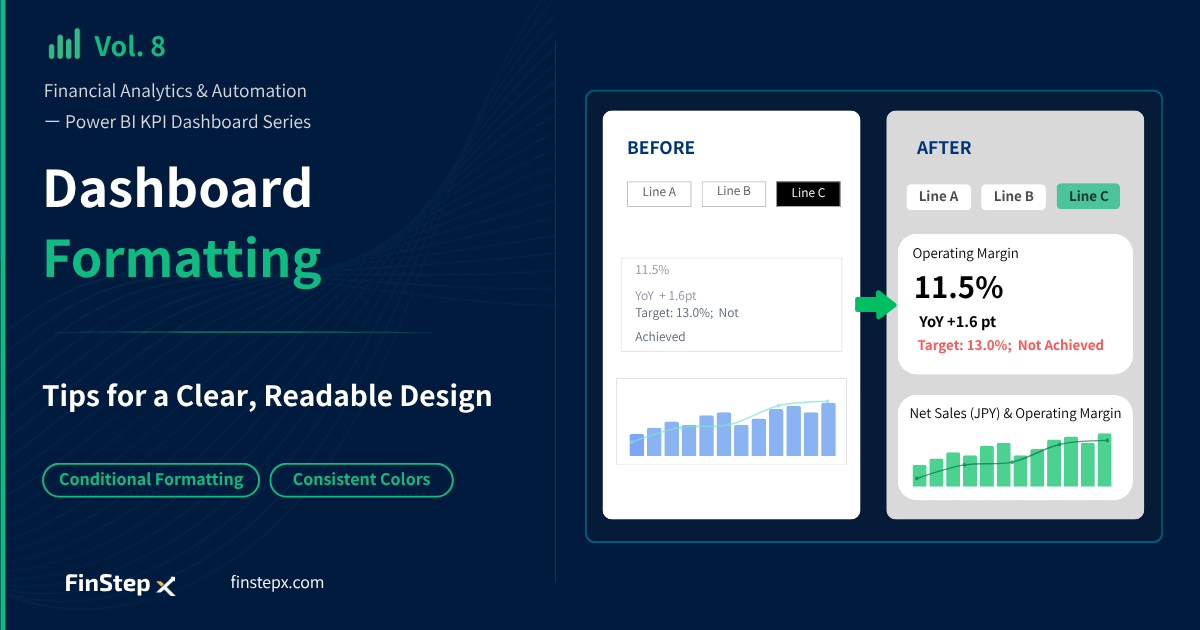
Financial Analytics & Automation / Power BI KPI Dashboard Creation Series
Introduction
In Vol. 7, we added slicers, cards, and charts to build the basic dashboard layout. However, the default formatting is not ideal for operational use.
In this article , we’ll refine the formatting and layout of the visuals to create a dashboard that is both easy to read and easy to use.
What We Will Adjust
We will make the following adjustments step by step.
| Item | Adjustment | Visuals Affected |
|---|---|---|
| Page background | Use a consistent light gray background | Entire page |
| Titles | Adjust text, font, and size | Slicers, Cards, Charts |
| Slicer selection color | Change the selected-state background color | Slicer |
| Cards | Adjust layout, font size, and borders | Cards |
| Conditional formatting | Change text color based on target achievement | Cards |
| Colors and legends | Standardize chart colors and legend names | Charts |
Step 1: Set the Dashboard Background Color
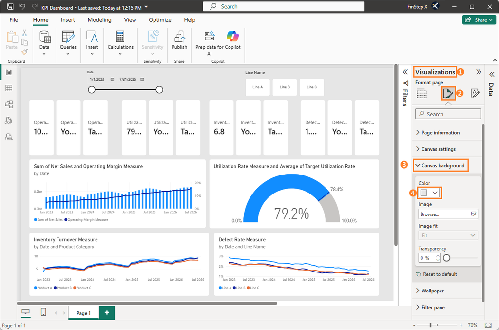
First, we will change the background color of the entire page to light gray (#E6E6E6). Using a light gray background helps the white Cards and Charts stand out and gives the dashboard a more consistent visual structure.
Click the canvas, then go to: Visualizations pane → Format Page → Canvas background, set the Color to light gray (#E6E6E6).
Step 2: Format the Date Slicer
1. Add a title and change the background color
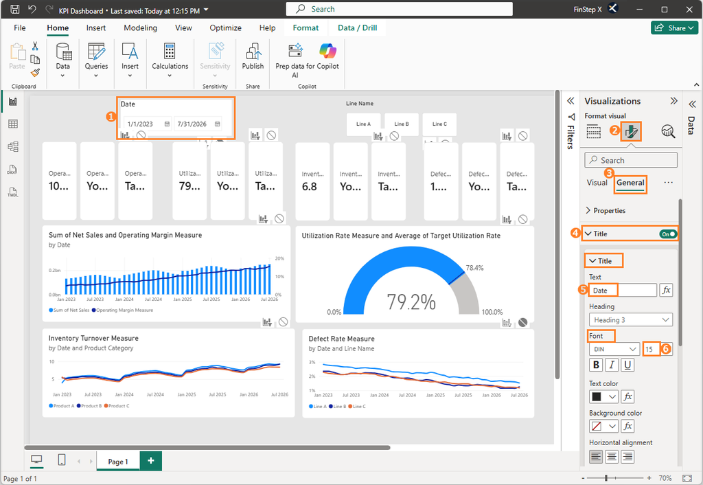
The date slicer can be difficult to read with its default settings, so we will adjust its title and font size.
Select the date slicer and go to: Format visual → General → Title → Title, enter Date in the title field and set the font size to 15.
To make the slicer stand out, change its background color to white under General → Effects → Background → Color.
2. Hide the Slicer header and the Slider
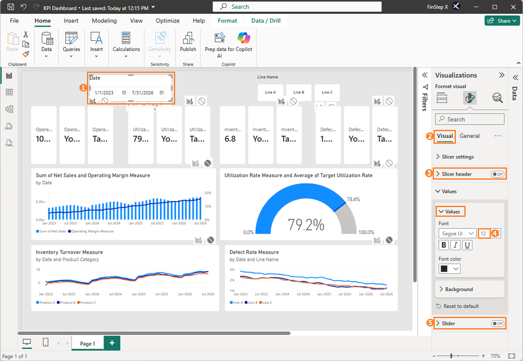
Under Visual, set Slicer header to Off.
Then increase the font size to 12 under Visual → Values → Value → Font.
Also set Slider to Off under Visual.
Step 3: Format the Production Line Slicer
1. Change the title font size and background color
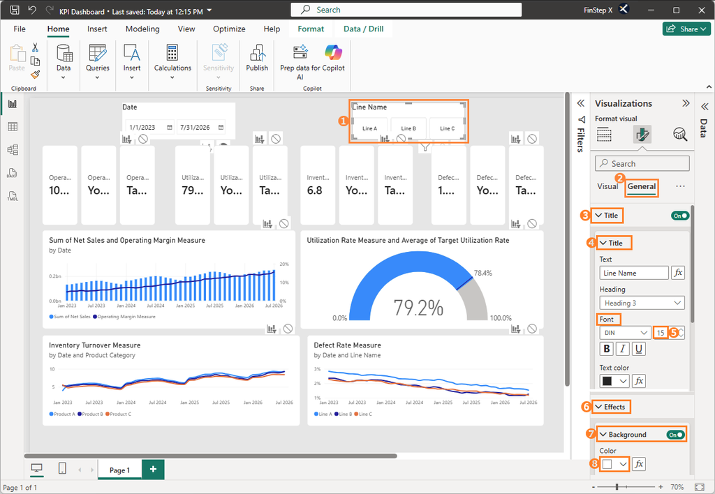
Select product line button slicer, set the font size to 15 under General → Title → Font, also change the background color to white under General➜ Effects ➜ Background ➜ Color.
2. Change the selected-state color
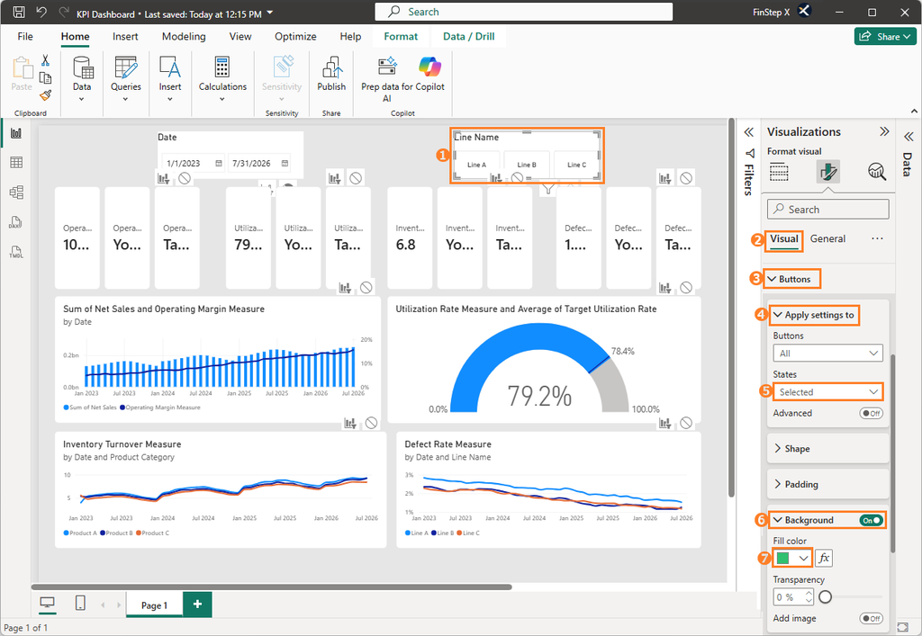
With the default settings, a selected button is highlighted in black. To match the overall color scheme of the dashboard, we will change the selected-state color.
Select the production line slicer and go to Visual → Buttons → Apply settings to → States → Selected, change the color to green (#2FC070) under Background → Fill color.
Step 4: Format the Card Visuals
Cards are one of the main elements of the dashboard, so we will carefully adjust their formatting to make the KPI information easy to read.
We will use Operating Margin as an example. The same steps can be applied to the other three Cards.
1. Add a Card title
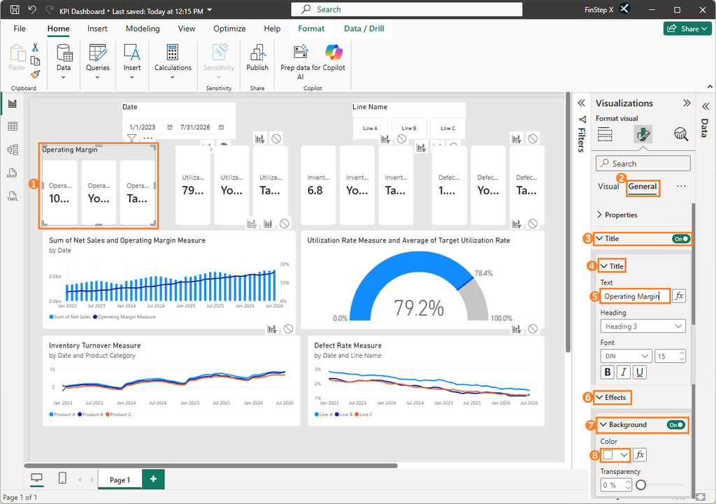
Go to: Format visual → General → Title → Title, turn the title On, then enter Operating Margin in the Text field.
Under Effects → Background, set the Card background color to white.
2. Change the sub-card layout to vertical
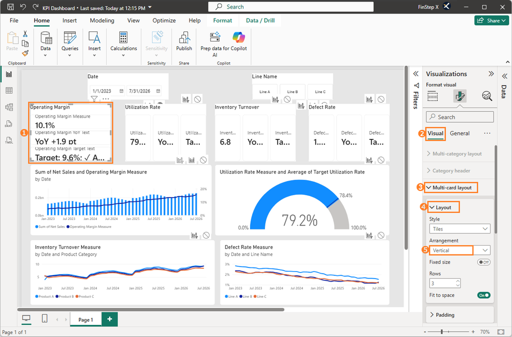
By default, the sub-cards are arranged horizontally. We will change them to a vertical layout.
Go to: Format visual → Visual → Multi-card layout → Layout, under Arrangement, select Vertical.
3. Hide the sub-card labels
Go to: Visual → Callout → Label, and set Label to Off.
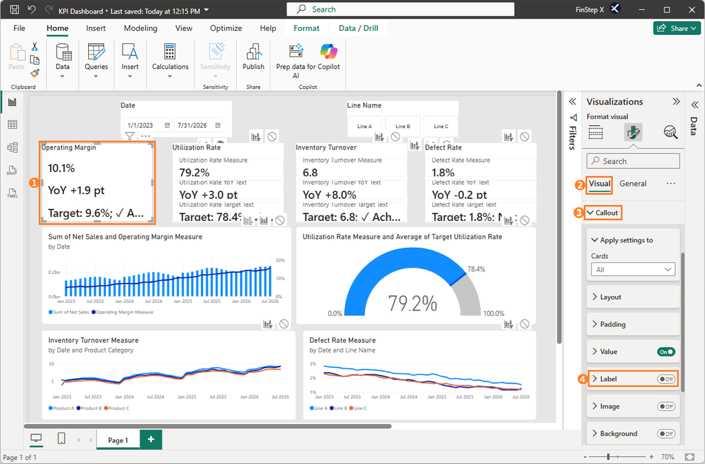
4. Adjust the sub-card font size
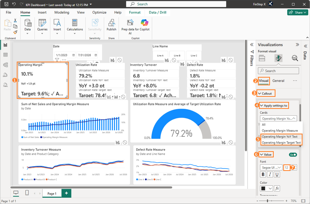
To make the main KPI value stand out, we will reduce the font size of the YoY and Target information.
Go to: Visual → Callout → Apply settings to, under Cards, select the Card you want to format.
Set the font size of the YoY and Target text to 12.
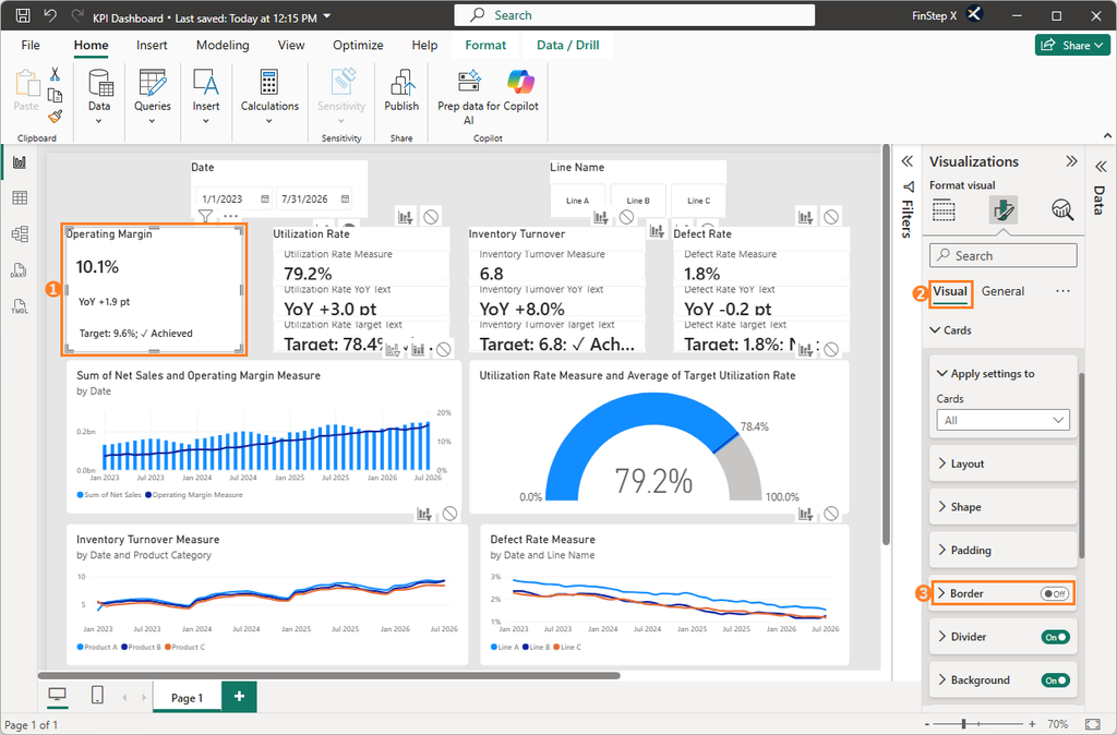
5. Hide the sub-card borders
Go to: Visual → Cards → Border, and set Border to Off.
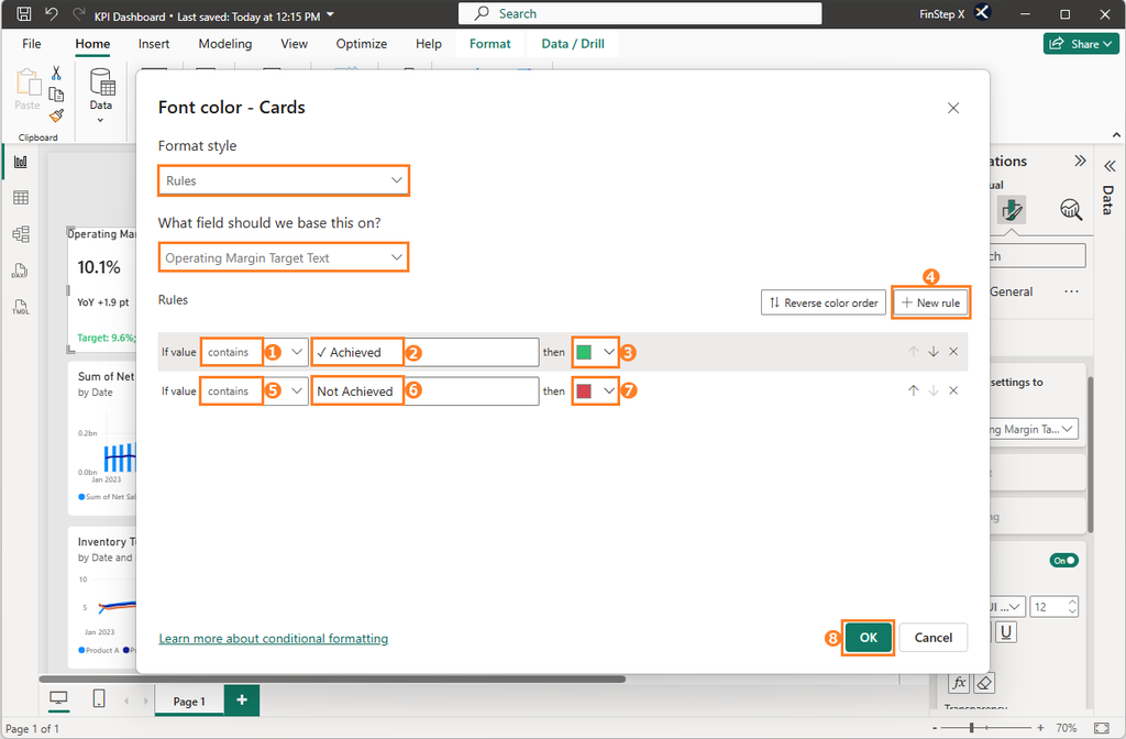
6. Add conditional formatting for target achievement
Using color to indicate target achievement makes the Card information much easier to scan.
Instead of creating a separate measure specifically to determine the target status, we will use the existing target-status text directly as the condition.
This approach is similar to conditional formatting in Excel and is relatively straightforward to set up.
Go to: Visual → Callout → Apply settings to → Cards, and select Operating Margin Target Text.
Next, under Value → Color, click the fx button in the lower-right corner.
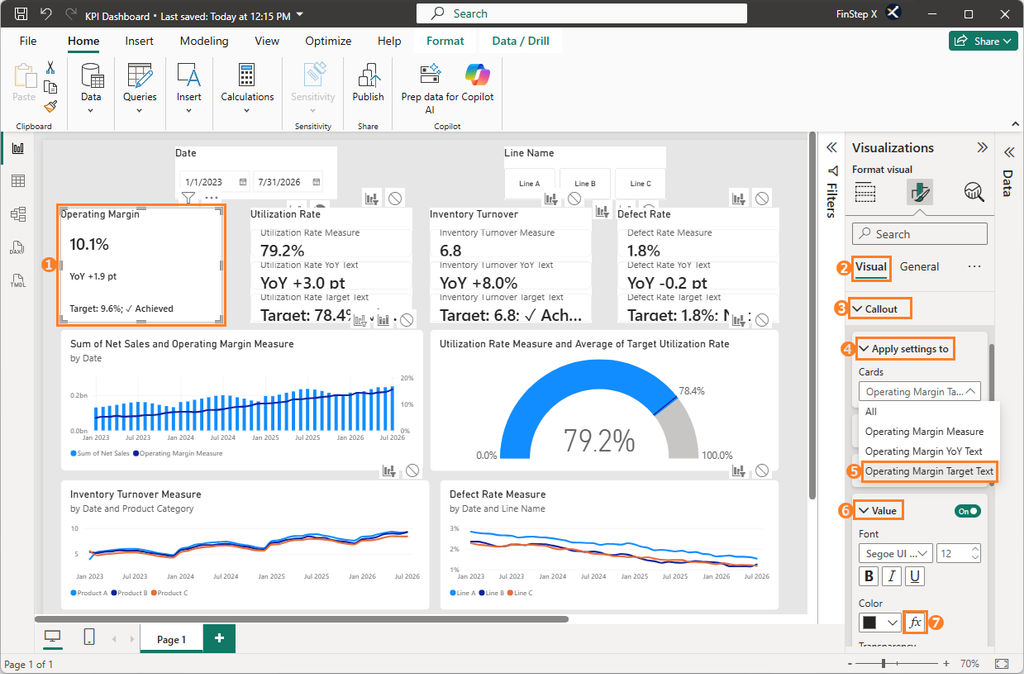
In the Font color – Cards dialog, confirm the following settings:
- Format style: Rules
- What field should we base this on?:
Operating Margin Target Text
Under Rules, configure the conditions based on the target-status text.
With this setup:
- If the text contains “✓ Achieved”, the font color changes to green (
#2FC070). - If the text contains “Not Achieved”, the font color changes to red (
#D64550).
Step 5: Format the Combo Chart
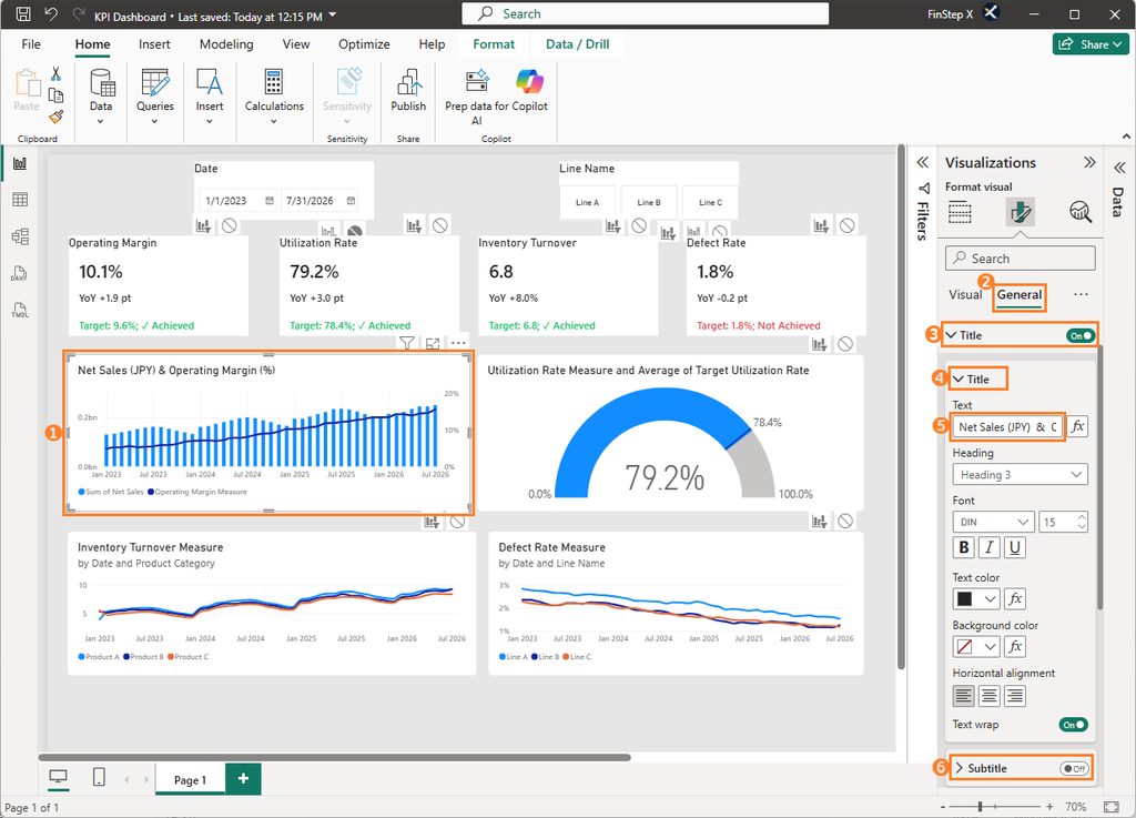
1. Add a title and configure the subtitle
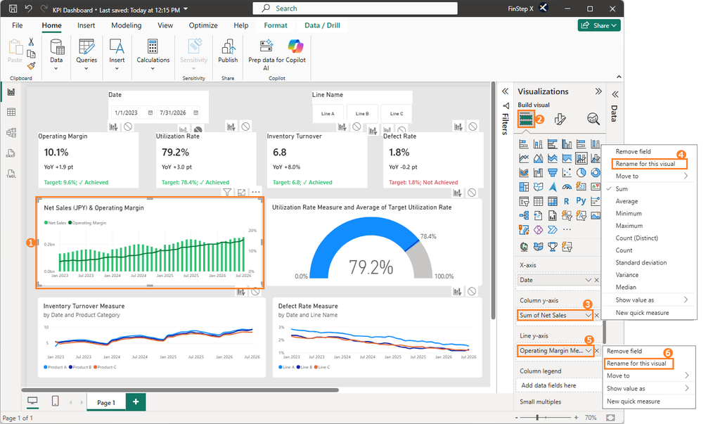
Go to: General → Title → Title, and enter Net Sales (JPY) & Operating Margin in the Text field.
Also, set the displayed Subtitle to Off.
2. Standardize the chart colors
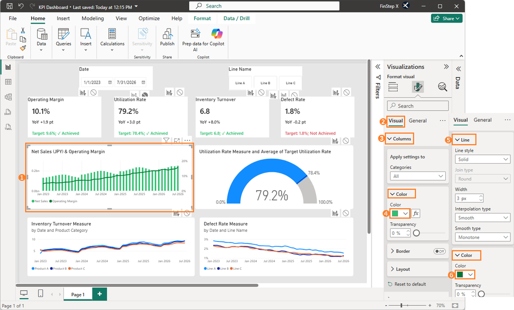
First, change the color of the columns. Go to: Visual → Columns → Color, and select green (#2FC070).
Next, change the color of the line. Go to: Visual → Lines → Color, and select dark green (#007735).
3. Change the legend position and names
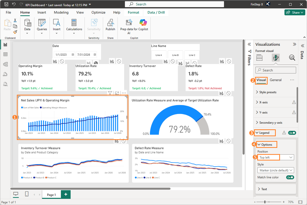
First, let’s move the legend from the default bottom-left position to the top-left.
Go to: Visual → Legend → Position, and select Top left.
Next, we will rename the column legend.
Under Build visual, click the drop-down arrow next to the field under Column y-axis.
Select Rename for this visual and change the name to Net Sales.
Finally, rename the line legend in the same way.
Click the drop-down arrow next to the field under Line y-axis, select Rename for this visual, and change the name to Operating Margin.
Step 6: Format the Gauge Chart
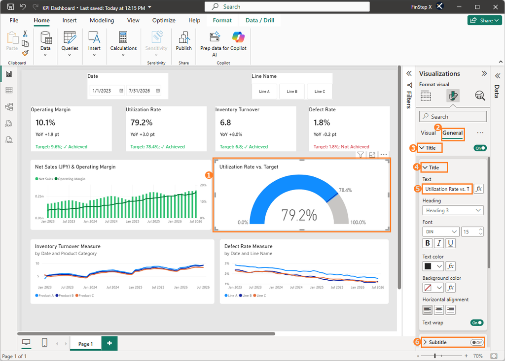
1. Add a title
Go to: General → Title → Title, and enter Utilization Rate vs. Target in the Text field.
2. Change the colors
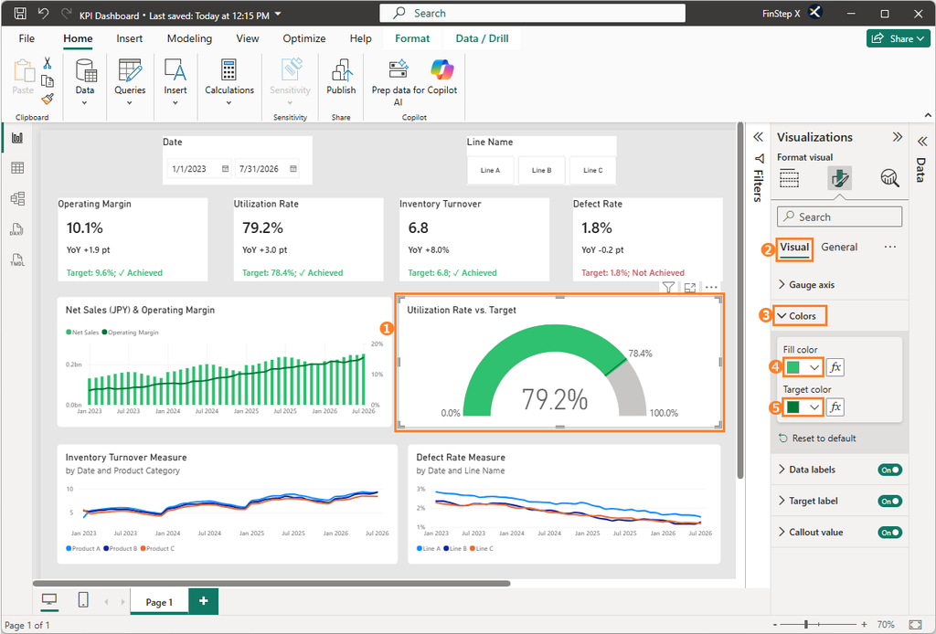
Go to: Visual → Colors → Fill color, and change the fill color to green (#2FC070).
Then change the Target color to dark green (#007735).
Step 7: Format the Line Charts
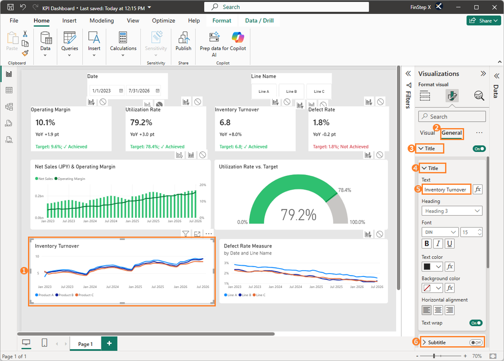
The screenshots in this section use the Inventory Turnover line chart as an example. Apply the same steps to the Defect Rate line chart.
1. Add a title
Go to: General → Title → Title, and enter Inventory Turnover in the Text field.
2. Change the line colors
Go to: Visual → Lines → Apply settings to, and select Product A, Product B, and Product C one at a time.
Set their colors as follows:
- Product A: Green (
#2FC070) - Product B: Orange (
#EB895F) - Product C: Light blue (
#70BBFF)
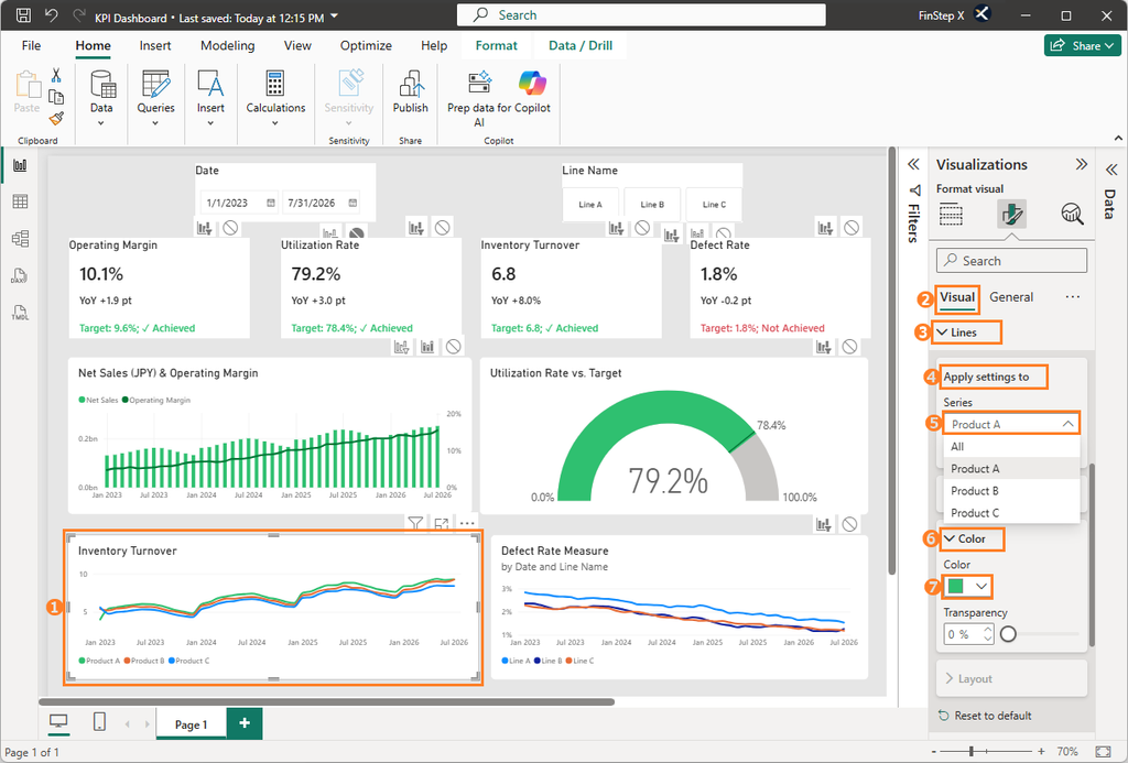
The legend is currently displayed at the bottom-left. If necessary, you can move it to the top-left. The procedure is the same as described in Step 5 – 3 for the combo chart.
Set up the Defect Rate line chart in the same way. Use “Defect Rate” as the title, and set the colors of the legend items (Line A, Line B, Line C) to the same green (#2FC070), orange (#EB895F), and light blue (#70BBFF) used in the Inventory Turnover chart.
Step 8: Adjust the Overall Dashboard Layout and Save
Finally, adjust the position and spacing of each visual.
Once the layout is finalized, press Ctrl + S to save the Power BI file.
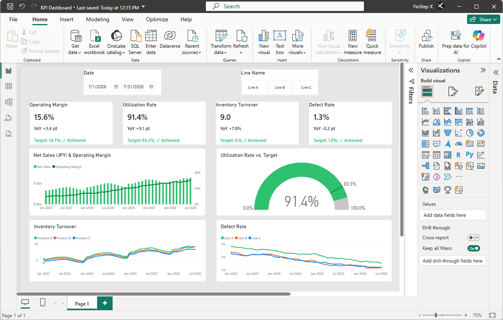
The dashboard now has a consistent color scheme, typography, and layout, making it much easier to read and use.
Summary
In this article, we refined the formatting and layout of the dashboard.
- Background: Use a light gray background to make the visuals stand out
- Titles: Make the purpose of each visual immediately clear
- Cards: Use a vertical layout to emphasize the main KPI values
- Conditional formatting: Use color to indicate target achievement
- Chart colors: Apply a consistent color scheme
- Legend names: Use clear and meaningful names
Each adjustment may seem minor on its own, but together they can make a significant difference between a dashboard that simply uses the default settings and one that is suitable for practical business use.
The dashboard is now a clear and practical tool for reviewing KPIs by reporting period and production line.
Frequently Asked Questions (FAQ)
1. Do I always need to add titles to my visuals?
No. Titles are not always necessary.
However, when multiple visuals are displayed together, titles make it easier for users to understand what each visual represents.
2. How should I choose colors for my visuals?
Avoid using too many colors and give each color a clear purpose.
For example, using consistent colors for achieved vs. not achieved or actual vs. target can make the dashboard easier to understand.
3. Why can a dashboard become harder to read even after formatting it?
You may have added too many formatting elements.
Think about what you want users to focus on most and prioritize the information accordingly. A good dashboard does not need to display every possible formatting option.
4. How can I align multiple visuals neatly?
Use Align and Distribute.
These functions make it easier to align multiple visuals and maintain consistent spacing between them.
5. Can I apply the same formatting to other visuals?
Yes. You can use Format painter to copy formatting from one visual and apply it to another.
What’s Next?
In Vol. 9, the final article in this series, we will explain how to share the completed dashboard, including the key steps and considerations for publishing and sharing it with others.