


Financial Analytics & Automation / Power BI Dashboard Creation Series
Introduction
In the previous article Vol. 4, we created a Calendar table and connected the four Fact tables to the Calendar table and the Line Master table, completing our star schema. With this setup, all of our tables are connected as a single data model, giving us a solid foundation for analyzing multiple Fact tables across different time periods and production lines.
Now, we can finally start using DAX to calculate the KPIs that will be displayed on our Dashboard.
In this article, we will first learn the basic concept of a Measure in DAX and how to use three basic functions — SUM, AVERAGE, and DIVIDE. We will then create the following four basic measures:
- Operating Margin Measure
- Defect Rate Measure
- Inventory Turnover Measure
- Utilization Rate Measure
Displaying year-over-year results and determining whether targets have been achieved require more advanced DAX. We will cover these topics in Vol. 6, “Creating Charts and Tables,” as we build visuals such as cards and gauges.
Step 1: What Is a Measure?
As briefly explained in the FAQ section of Vol. 3, Power BI provides two main ways to perform calculations on data: Calculated Columns and Measures.
1. Calculated Column
A Calculated Column is calculated row by row, and the resulting value is stored as part of each row in the table.
In Power BI, there are two ways to create a column used for calculations: you can create a Custom Column in Power Query, or create a Calculated Column using DAX in the data model.
A Custom Column in Power Query is created as part of the data transformation process before the data is loaded into Power BI. A DAX Calculated Column, on the other hand, is created after the data has been loaded into the data model.
In other words, both are calculated columns, but they are created in different places and at different stages of the data preparation process.
The “Operating Margin” and “Defect Rate” we created in Vol. 3 are calculated columns created using the “Add Custom Column” feature in Power Query.
2. Measure
A Measure does not store a fixed calculation result for each row. Instead, it calculates a value dynamically based on the filter context in the report.
For example, when you display data by month or production line, or select a specific period or line using a slicer, the result of a Measure changes automatically based on those selections.
The Difference Between Calculated Columns and Measures
A Calculated Column is a fixed value calculated and stored for each row, while a Measure is a dynamic value calculated based on the current filter context.
This difference is much easier to understand by actually creating and using a Measure than by simply reading about it, so let’s see how it works in the steps that follow.
Step 2: Create three measures
In this step, we will create three measures: Operating Margin Measure, Defect Rate Measure, and Inventory Turnover Measure.
All three follow the same basic approach: first aggregate the underlying amounts or quantities, and then use DIVIDE to calculate the ratio.
1. Create the Operating Margin Measure
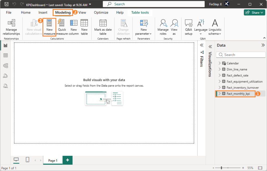
First, select the Fact_monthly_kpi table in the “Data” Pane. Then, go to the “Modeling” tab and click “New Measure”.
Enter the following DAX formula in the “Formula Bar” and press “Enter.”
Operating Margin Measure =
DIVIDE(
    SUM(Fact_monthly_kpi[Net Sales])
        - SUM(Fact_monthly_kpi[COGS])
        - SUM(Fact_monthly_kpi[SG&A]),
    SUM(Fact_monthly_kpi[Net Sales])
)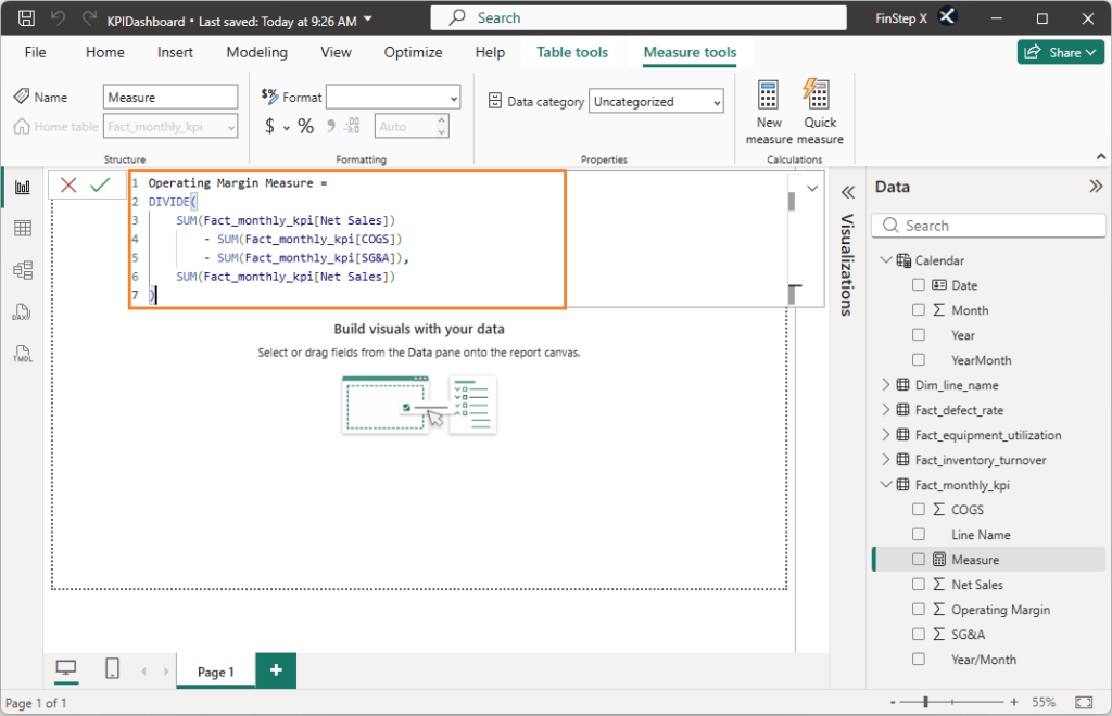
Looking at the “Data” Pane on the right side of the screen, you will see both Operating Margin and Operating Margin Measure.
Operating Margin is a calculated column we created in Vol 3 using the “Add Custom Column” feature in Power Query. In contrast, Operating Margin Measure, which has the calculator icon, is the Measure we just created using DAX.
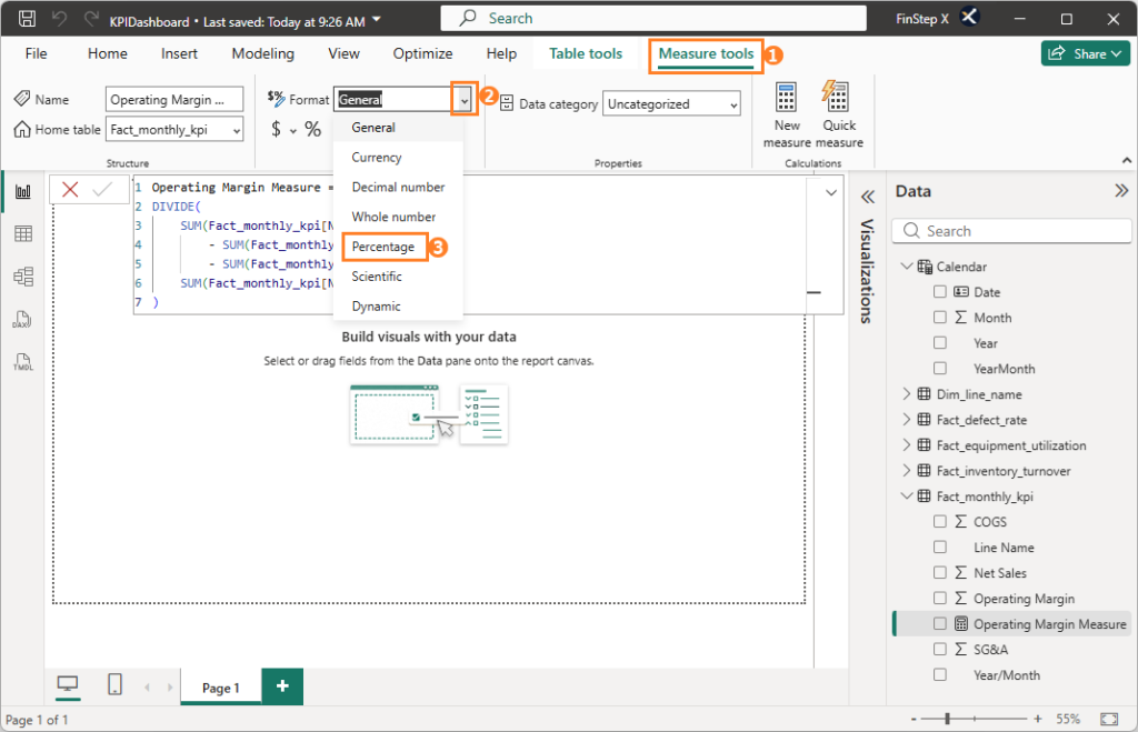
Change the data type of the “Operating Margin Measure” to “Percentage.”
Why Not Simply Use the Operating Margin Calculated Column?
The Operating Margin Calculated Column we created in Vol. 3 represents the ratio for each individual row, such as one month and one production line. If you simply average this column, each row is given equal weight regardless of its sales volume.
For example, suppose one production line has Net Sales of ¥10 million and an Operating Margin of 20%, while another has Net Sales of ¥1 million and an Operating Margin of 10%. A simple average would give you 15%.
However, when the difference in sales volume is taken into account, the overall Operating Margin is approximately 19.1%.
Therefore, for ratios such as Operating Margin that are calculated from a numerator and denominator, you should not simply average the individual ratios. Instead, aggregate the underlying amounts or quantities first and then calculate the ratio.
In this Measure, we first use SUM to aggregate Net Sales, COGS, and SG&A, and then calculate the Operating Margin Measure.
About the DIVIDE Function
In DAX, you can also use “/” for division. However, this can result in an error when the denominator is zero.
When you use the DIVIDE function, it returns a “blank” by default when the denominator is zero or blank.
For this reason, DIVIDE is commonly used when calculating ratios in DAX.
2. Create the Defect Rate Measure
Next, let’s create the Defect Rate Measure.
Defect Rate Measure =
DIVIDE(
    SUM(Fact_defect_rate[Defect Quantity]),
    SUM(Fact_defect_rate[Production Quantity])
)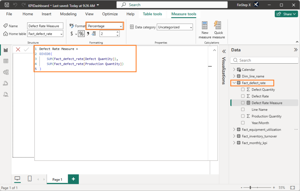
Just like with Operating Margin, we first aggregate Defect Quantity and Production Quantity, and then divide them.
As with the Operating Margin Measure, change the “data type” to “Percentage”.
The key point here is not to simply average the Defect Rate column created in Vol. 3. Instead, aggregate the underlying quantities using SUM and then calculate the ratio using DIVIDE.
3. Create the Inventory Turnover Measure
Finally, let’s create the Inventory Turnover Measure.
Inventory Turnover Measure =
DIVIDE(
    SUM(Fact_inventory_turnover[COGS]) * 12,
    (SUM(Fact_inventory_turnover[Beginning Inventory])
  + SUM(Fact_inventory_turnover[Ending Inventory])) / 2
)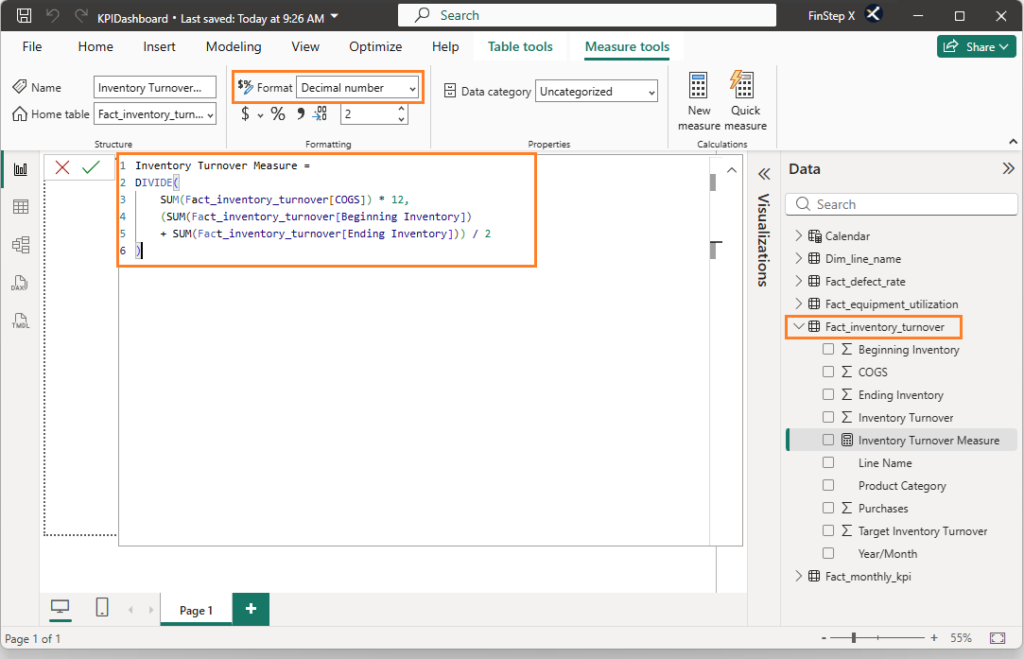
The Inventory Turnover Measure is calculated by dividing annualized COGS by average inventory.
Because our data is monthly, we multiply COGS by 12 to annualize it. The denominator is the average of Beginning Inventory and Ending Inventory.
Again, the key point is not to simply average the Inventory Turnover column created in Vol. 3, Instead, aggregate the underlying amounts first and then calculate the turnover ratio.
Step 3: Create the Utilization Rate Measure
Next, let’s create the Utilization Rate Measure.
Utilization Rate Measure =
AVERAGE(Fact_equipment_utilization[Utilization Rate])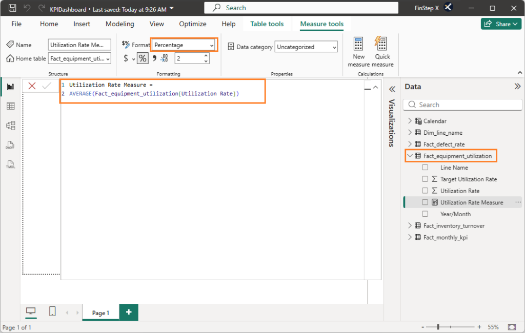
The difference between Utilization Rate and Operating Margin or Defect Rate is that each row in the Fact_equipment_utilization table already represents the calculated utilization rate for a specific month and production line.
In addition, the available operating hours, which serve as the denominator for each row, are roughly the same across lines and months. As a result, there is very little difference between a simple average and a weighted average.
Therefore, instead of aggregating the numerator and denominator separately and then using DIVIDE, we can simply use the AVERAGE function here.
Set the “data type” of Utilization Rate to “Percentage” as well.
Step 4: Check the Measures Using Visuals
Once you have created all four Measures, let’s place them in visuals and see how they work.
- From the “Data” Pane, drag the Operating Margin Measure into the “Report” View.
- In the same way, drag Defect Rate Measure, Inventory Turnover Measure, and Utilization Rate Measure into the “Report” View.
- From the “Data” Pane, drag the
Yearcolumn from theCalendartable we created in Vol. 4 into the “Report” View, then click the “Slicer” button in the “Visual” Pane. - Once the year buttons appear, select a different year and check that all four visuals change.
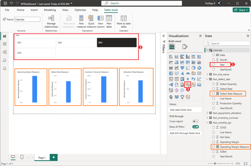
Each time you change the selected year, the values displayed in the four visuals should change.
This is the behavior we described in Step 1: Measures are dynamically recalculated based on the filter context.
When you filter the data using Year from the Calendar table, that filter is propagated to the Fact tables, and each Measure is recalculated using the data for the selected year.
Step 5: Save the file
Once you have finished the setup, save the file by pressing Ctrl + S.
The KPIDashboard.pbix file we created in Vol. 4, will now contain the four basic Measures we just created.
Frequently Asked Questions
1. What is the difference between a Power BI Measure and a Calculated Column?
A Calculated Column stores a calculated value for each row, while a Measure is a value that is calculated dynamically based on the filter context in the report.
For example, when you change the period or production line using a slicer, the result of a Measure automatically changes.
Therefore, when displaying aggregated values or KPIs in a Dashboard, Measures are generally the preferred approach.
2. How can I correctly aggregate ratios and percentages in Power BI?
For ratios such as Operating Margin and Defect Rate, you generally should not simply average the ratios themselves. Instead, aggregate the numerator and denominator separately, and then calculate the ratio.
For example, for Operating Margin, you can use SUM to aggregate Net Sales, COGS, and SG&A, and then use DIVIDE to calculate the margin.
This allows you to calculate an appropriate overall ratio even when aggregating data across production lines or periods with different sales volumes.
3. How should I use SUM and AVERAGE in Power BI?
The appropriate function depends on the nature of the data.
・SUM: Use for amounts and quantities that make sense to aggregate, such as Net Sales, COGS, and production quantities.
・AVERAGE: Use when taking a simple average of the individual row values is appropriate.
・DIVIDE: Use when calculating a ratio from a numerator and denominator.
However, AVERAGE is not always the right choice. When the denominator of a ratio varies significantly between rows, you should aggregate the underlying data first and then calculate the ratio.
4. What is the difference between the DAX DIVIDE function and the “/” operator?
Both can be used for division, but the DIVIDE function is designed to handle cases where the denominator is zero or blank more safely.
When the denominator is zero or blank, DIVIDE returns a blank (BLANK) by default.
For this reason, when calculating ratios or percentages in DAX, DIVIDE is generally recommended over the simple / operator.
5. Which table should I create a DAX Measure in?
You can create a Measure in any table. As long as the calculation formula and data model are the same, the calculation result will not change.
However, as the number of Measures increases, keeping them organized becomes more important. You can either create Measures in the related Fact tables or create a dedicated Measure table to keep all Measures in one place.
In this series, we prioritize simplicity and clarity, so we create each Measure in its related Fact table—for example, the Operating Margin Measure in Fact_monthly_kpi and the Defect Rate Measure in Fact_defect_rate.
Summary
In this article, we created four basic KPI Measures using DAX.
| KPI | Main Functions Used | Calculation Approach |
|---|---|---|
| Operating Margin | SUM + DIVIDE | Aggregate the amounts first, then calculate the margin |
| Defect Rate | SUM + DIVIDE | Aggregate the quantities first, then calculate the defect rate |
| Inventory Turnover | SUM + DIVIDE | Aggregate the amounts first, then calculate the turnover ratio |
| Utilization Rate | AVERAGE | Take the average of the individual ratios |
The key takeaway from this article is not simply memorizing DAX syntax.
What matters is understanding which function—SUM, AVERAGE, or DIVIDE—is appropriate for the type of data you are working with.
We also used visuals and a slicer to confirm that Measures are dynamically recalculated based on the filter context.
With these steps complete, we now have the basic DAX Measures needed to display KPIs on our Dashboard.
Coming Up Next
In Vol. 6, “Creating Charts and Tables,” we’ll use the Measures created in this article to build actual Dashboard visuals, including cards, gauges, combo charts, and line charts. We’ll also add new DAX Measures tailored to each visual, such as ones for year-over-year comparisons and target achievement. Let’s get hands-on and watch the Dashboard gradually take shape.