


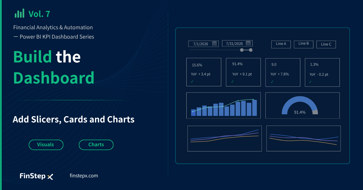
Financial Analytics & Automation / Power BI KPI Dashboard Creation Series
Introduction
In Vol. 6, we created DAX measures to display year-over-year (YoY) changes and target achievement status.
Now it’s time to start building the dashboard itself.
In this step, we’ll add Slicers to filter data by date and production line, Cards to display KPIs, and Charts to visualize trends. By placing these visuals on the report canvas, we’ll begin shaping the dashboard.
Visuals Used in This Dashboard
We’ll create 10 visuals in total, using 6 different visual types in this article.
| Visual | Count | Measure / Column Used |
|---|---|---|
| Slicer (Between) | 1 | Calendar[Date] |
| Button Slicer | 1 | Dim_line_name[Line Name] |
| Card | 4 | KPI measure + YoY Text + Target Text |
| Line and stacked column chart | 1 | Net Sales, Operating Margin Measure |
| Gauge chart | 1 | Utilization Rate Measure, Target Utilization Rate |
| Line chart | 2 | Inventory Turnover Measure, Defect Rate Measure |
Step 1: Add a Date Slicer
First, add a Slicer to filter the data by date.
From the Visualizations pane, select the Slicer visual.
Place it in the upper-left corner of the Report View, then drag the Date column from the Calendar table into the Field well.
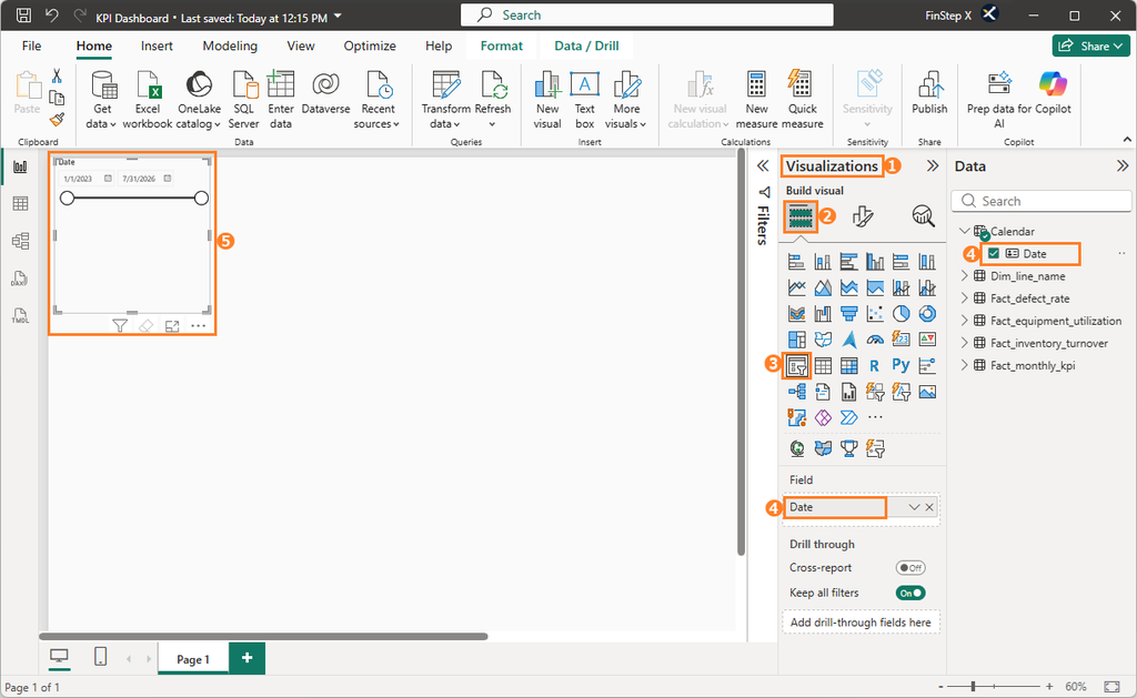
For this dashboard, we’ll use a Between slicer, which lets users select a start date and an end date.
To display the latest month’s KPIs when the dashboard opens, set the slicer range to 07/01/2026 – 07/31/2026.
If no date range is selected, all available data will be included.
Step 2: Add a Button Slicer for Production Lines
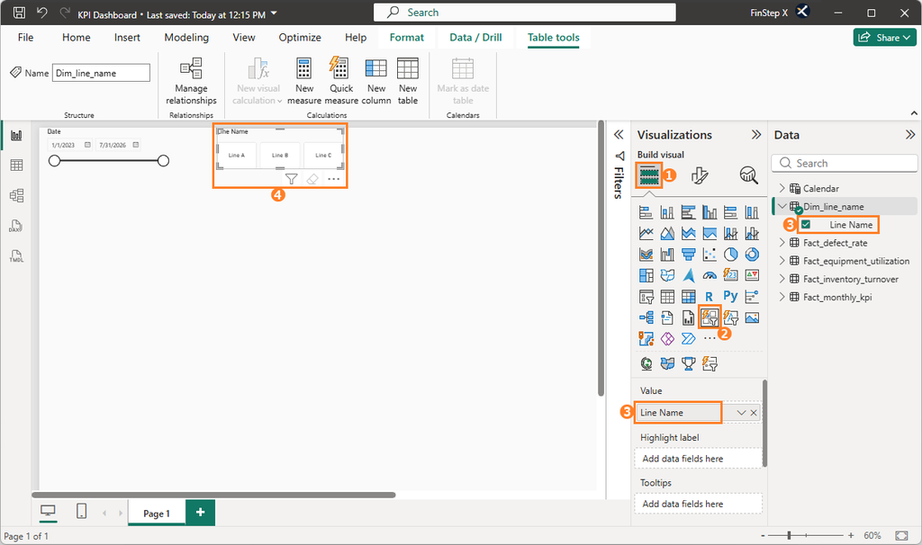
To view KPIs by production line, add a Button Slicer.
Place a Button Slicer in the Report View, then drag the Line Name column from the Dim_line_name table into the Value field.
Step 3: Add KPI Card Visuals
Next, we will add Card visuals to display the four main KPIs.
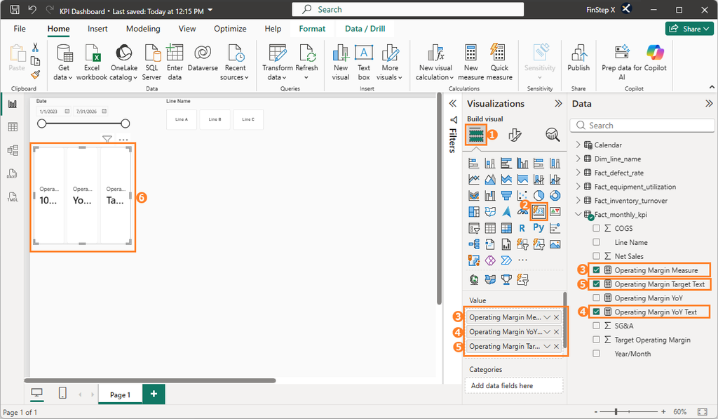
Let’s start with the Operating Margin Card.
Place a Card below the date slicer. Then add the following measures to the Value field in this order:
Operating Margin MeasureOperating Margin YoY TextOperating Margin Target Text
When you add multiple fields to a Card visual, each field is displayed as a sub-card. We will adjust the layout and formatting of these sub-cards in Vol.8.
Repeat the same steps for the remaining three Cards (Utilization Rate,Inventory Turnover, Defect Rate). For each Card, add its corresponding KPI measure, YoY Text measure, and Target Text measure.
Step 4: Add a Combo Chart for Monthly KPIs
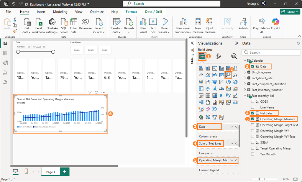
Next, let’s add a Line and stacked column chart to visualize Net Sales and Operating Margin together. This allows us to compare sales and profitability trends in a single visual.
Add the combo chart to the Report View and configure the fields as follows:
- X-axis:
Calendar [Date] - Column y-axis:
Fact_monthly_kpi [Net Sales] - Line y-axis:
Fact_monthly_kpi [Operating Margin Measure]
Step 5: Add a Gauge Chart for Utilization Rate
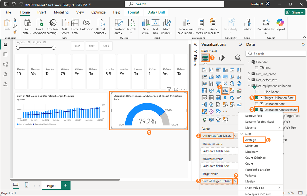
Next, let’s add a Gauge chart to compare the actual Utilization Rate with its target.
Add a Gauge chart to the Report View and configure the fields as follows:
- Value:
Fact_equipment_utilization [Utilization Rate Measure] - Target Value:
Fact_equipment_utilization [Target Utilization Rate]
By default, Power BI may use Sum as the aggregation method for the Target Value. Click the drop-down arrow next to the field and change the aggregation to Average.
Step 6: Add a Line Chart for Inventory Turnover
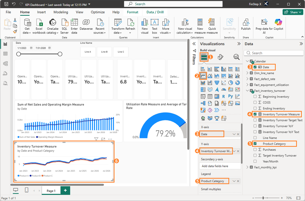
Next, let’s add a Line chart to visualize Inventory Turnover by product category.
From the Visualizations pane, select Line chart and place it in the Report View.
Configure the fields as follows:
- X-axis:
Calendar [Date] - Y-axis:
Fact_inventory_turnover [Inventory Turnover Measure] - Legend:
Fact_inventory_turnover [Product Category]
Step 7: Add a Line Chart for Defect Rate
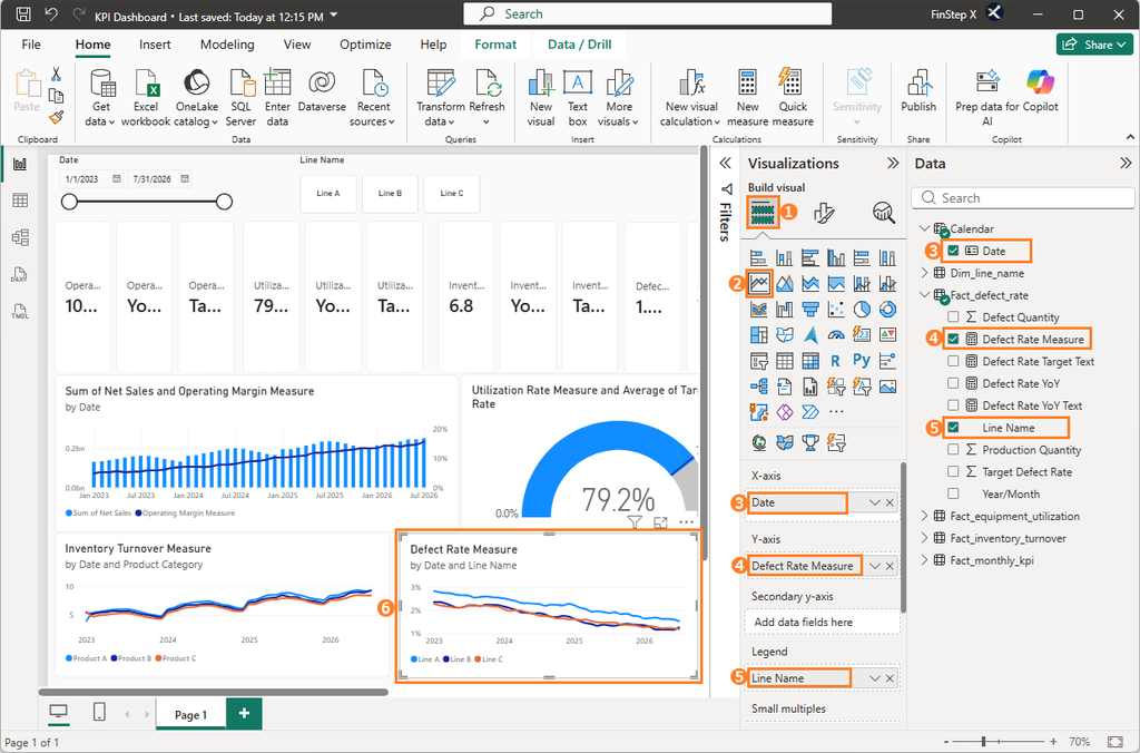
Finally, add a Line chart to visualize Defect Rate by production line.
Configure the fields as follows:
- X-axis:
Calendar [Date] - Y-axis:
Fact_defect_rate [Defect Rate Measure] - Legend:
Fact_defect_rate [Line Name]
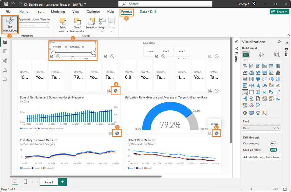
Step 8: Configure the Date Slicer’s Interactions
In this dashboard, the combo chart and line charts are used to show trends over the entire data period.
However, the date slicer allows users to select dates at the day level. Since the monthly data is stored using the first day of each month, selecting a period shorter than one month may result in no data being displayed in these charts.
To avoid this issue, exclude the following three charts from the date slicer’s filter interactions:
- Combo chart
- Inventory Turnover line chart
- Defect Rate line chart
With the date slicer selected, go to Format → Edit interactions. For each of the three charts listed above, click the None icon (the circle with a diagonal line) that appears in the upper-right corner of the visual.
The combo chart and the line charts will now always show the full data period, regardless of the date slicer.
Step 9: Save the Power BI File
Once all visuals have been added and configured, press Ctrl + S to save the Power BI file.
Your dashboard is now ready in its basic form, allowing you to filter data by date and production line.
Summary
In this article, we added 10 visuals across 6 visual types and used Edit Interactions to adjust how the date slicer affects each visual.
- Slicer and Button Slicer: Filter data by date and production line
- Cards: Display current KPI values, YoY results, and target status
- Combo Chart: Show revenue and operating margin trends
- Gauge Chart: Compare utilization rate against the target
- Line Charts: Show inventory turnover and defect rate trends
One of Power BI’s greatest strengths is that users can interact with data by changing filter selections.
With this step complete, you now have a dashboard with the core interactive features in place.
Frequently Asked Questions (FAQ)
1. How should I choose between different types of slicers?
・Need to specify a date range → Use a standard Slicer
・Want users to make selections from predefined options → Use a Button Slicer
2. Why is the slicer selection not reflected in some charts?
Those charts may have been excluded using Edit interactions.
In this series, we intentionally exclude the combo chart and line charts from the date slicer’s filter interactions (Step 8).
3. How are multiple fields displayed when I add them to a Card?
When multiple fields are added to a card, each field is displayed as a subcard.
We’ll arrange the subcards vertically and apply formatting in Vol.8.
4. Can I use fields from different tables in the same visual?
Yes.
However, the data model must have the appropriate relationships between the tables. If the relationships are not configured correctly, the visual may not behave as expected.
5. How should I choose the right visual?
Choose a visual based on what you want to see.
・Current value → Card
・Trends over time → Line Chart
・Actual vs. target → Gauge Chart
・Multiple KPIs in one view → Combo Chart
What’s Next?
In Vol. 8, we will improve the readability of the visuals we added in this article by adjusting formatting and layout.