


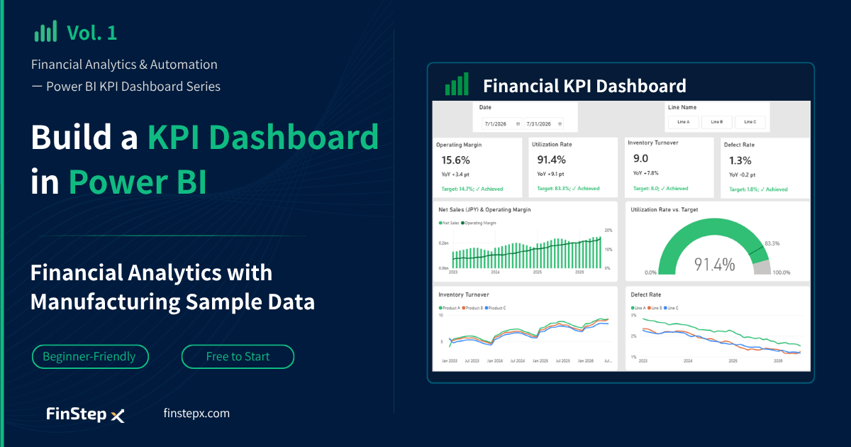
Financial Analytics & Automation / Power BI KPI Dashboard Creation Series
Introduction
In finance and management reporting, a significant amount of time is often spent preparing monthly reports.
Data collection, Excel-based calculations, chart updates, and preparing materials for management meetings can easily add up. If these tasks take 8–13 hours each month, that means approximately 96–156 hours per year are spent on repetitive reporting work.
| Task | Time Spent per Month |
|---|---|
| Data collection and export | 1 to 2 hours |
| Data processing in Excel | 2 to 3 hours |
| Updating charts and tables | 1 to 2 hours |
| Data review and corrections | 2 to 3 hours |
| Preparing management reports | 2 to 3 hours |
| Total | 8 to 13 hours (approx. 96 ~ 156 hours per year) |
By automating and standardizing these processes with Power BI, finance and management teams can spend more time on analyzing business performance and supporting management decision-making.
In this series, we will use sample manufacturing data to walk through the entire process—from preparing data with Power Query to calculating KPIs and visualizing them in an interactive dashboard with Power BI.
The KPI Dashboard We Will Build
The dashboard in this series is designed to provide a view of both manufacturing performance and overall business performance from four perspectives:
- Profitability — Operating Margin
- Productivity — Equipment Utilization Rate
- Inventory — Inventory Turnover
- Quality — Defect Rate
The top section of the dashboard displays key KPIs, while the lower section provides charts for analyzing KPI trends and breakdowns. Slicers for filtering by date and production line are also included. You can review the current value, year-over-year change, target achievement, and trends all on a single screen.
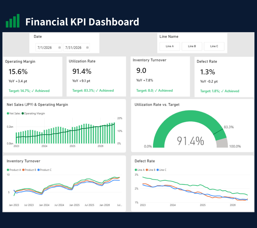
Using a Power BI Dashboard to Spot Changes in Performance
The KPIs for the latest month (July 2026) in our fictional sample data are as follows:
- Operating Margin: YoY +3.4 pt
- Equipment Utilization Rate: YoY +9.1 pt
- Inventory Turnover: YoY +7.8%
- Defect Rate: YoY -0.2 pt
Equipment utilization and inventory turnover have improved significantly, while the improvement in operating margin is relatively small and the defect rate has improved only slightly. Reviewing the KPIs by production line reveals that Line C’s operating margin is below its target, which is pulling down the overall operating margin. The next step is to identify why Line C is missing its target.
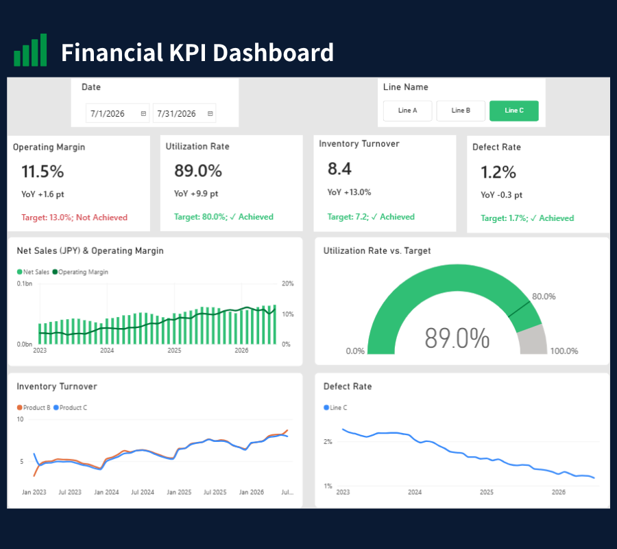
A dashboard shows “where the issues are” and provides a starting point for the next analysis.
Power Query and Power BI
In this series, we will use Power Query and Power BI together to build the dashboard.
| Tool | Role |
|---|---|
| Power Query | Data import, cleansing, transformation, and preparation |
| Power BI | KPI calculations, data visualization, and report creation |
The transformation steps created in Power Query and the DAX measures created in Power BI are saved in the file, so they can be reused in subsequent months.
For the monthly data update, you still need to replace the CSV files, refresh the data, and republish the report, but this process takes only a few minutes. You do not need to redo the Excel aggregation or recreate the charts (we will explain this in Vol. 9).
How Does Power BI Change the Way Finance Teams Work?
With Power BI, the role of finance and management reporting teams can shift from repetitive report creation tasks toward financial analysis and decision-making support.
Before: Focus on data preparation and reporting
Data collection → Data processing → Chart creation → Report preparation
After: Focus on analysis
Data refresh → Dashboard review → Performance analysis
This gives you more time for financial analysis work such as:
- Analyzing the drivers behind declining profit margins
- Assessing the impact of rising costs
- Examining opportunities to reduce inventory
- Analyzing budget vs. actual variances
Series Overview
This nine-part series walks through the process of building a KPI dashboard step by step.
By the end of the series, you will have the knowledge needed to build a KPI dashboard of your own.
| Vol. | Article |
|---|---|
| Vol. 1 | How to Build a KPI Dashboard in Power BI: Manufacturing KPI Example (This article) |
| Vol. 2 | How to Install Power BI Desktop: The First Step in Building a Dashboard |
| Vol. 3 | How to Import CSV Files into Power BI: Power Query Basics |
| Vol. 4 | How to Create a Calendar Table in Power BI: DAX & Relationships |
| Vol. 5 | How to Create Power BI KPI Measures: DAX SUM, AVERAGE and DIVIDE |
| Vol. 6 | How to Calculate YoY and Target Achievement in Power BI: DAX Measures |
| Vol. 7 | How to Add Slicers, Cards and Charts in Power BI: Dashboard Layout |
| Vol. 8 | How to Format a Power BI Dashboard: Fonts, Colors and Layout |
| Vol. 9 | How to Share a Power BI Report: Publish and Set Permissions |
Summary
Power BI can streamline repetitive monthly tasks such as data preparation and report creation to provide a consistent way to monitor business KPIs over time.
Power Query can be used to import and transform data, while Power BI can be used to calculate KPIs, visualize data, and create reports.
By building this type of reporting system, finance and management reporting teams can spend less time on repetitive data preparation and more time understanding changes in performance, investigating their underlying drivers, and supporting better business decisions.
Frequently Asked Questions (FAQ)
1. Is Power BI free to use?
Power BI Desktop is free to use. It is sufficient for personal learning and for building dashboards.
To share reports within an organization, a Power BI license is required depending on your environment.
2. If I know Excel, can I use Power BI?
Power Query is also available in Excel, so your experience with data preparation in Excel can be applied directly in Power BI.
3. What is the difference between Power BI and Excel?
Excel is strong for individual, ad hoc analysis, while Power BI is strong at integrating, visualizing, and sharing data from multiple sources.
Power BI is not replacing Excel but is playing a complementary role of Excel.
4. Is this series useful for finance professionals outside manufacturing?
Yes. How to build a data model, how to think about DAX, and how to build a dashboard are the same regardless of industry. Simply replace the KPIs with those of your own company.
What’s Next?
In Vol.2, we will cover how to install Power BI Desktop and walk through its basic interface—the first step toward building your own dashboard.